Crossbridge’s Custom Graphic Design Services: How Color Psychology Impacts Your Marketing
In the vibrant world of marketing, color is a powerful psychological tool. For businesses seeking custom graphic design services for marketing materials, understanding the impact of color is non-negotiable. At Crossbridge Marketing, we dive deep into the psychology of color to craft visually compelling brands that resonate. Choosing the right colors for your brand is a strategic decision that directly influences perception, emotion, and ultimately, consumer behavior. In fact, studies suggest that upwards of 85% of consumers choose a product based on color alone.
Color and Emotion: A Direct Connection
Color evokes power, emotion, and trust, fundamentally influencing how your brand is perceived. Consider the emotional responses these different colors typically trigger:
Blue: Often used by graphic design companies specializing in branding, blue is a popular choice for initiating feelings of calmness, trust, and reliability. Think of banks or tech companies.
Red: This bold color evokes feelings of urgency, power, and even hunger. It's frequently seen in sales and food industries for its ability to grab attention.
Black: Denoting sophistication, luxury, and wealth, black is a classic choice for high-end brands.
Green: Promoting nature, earthy feelings, and eco-friendliness, green is a natural fit for environmental or health-conscious brands.
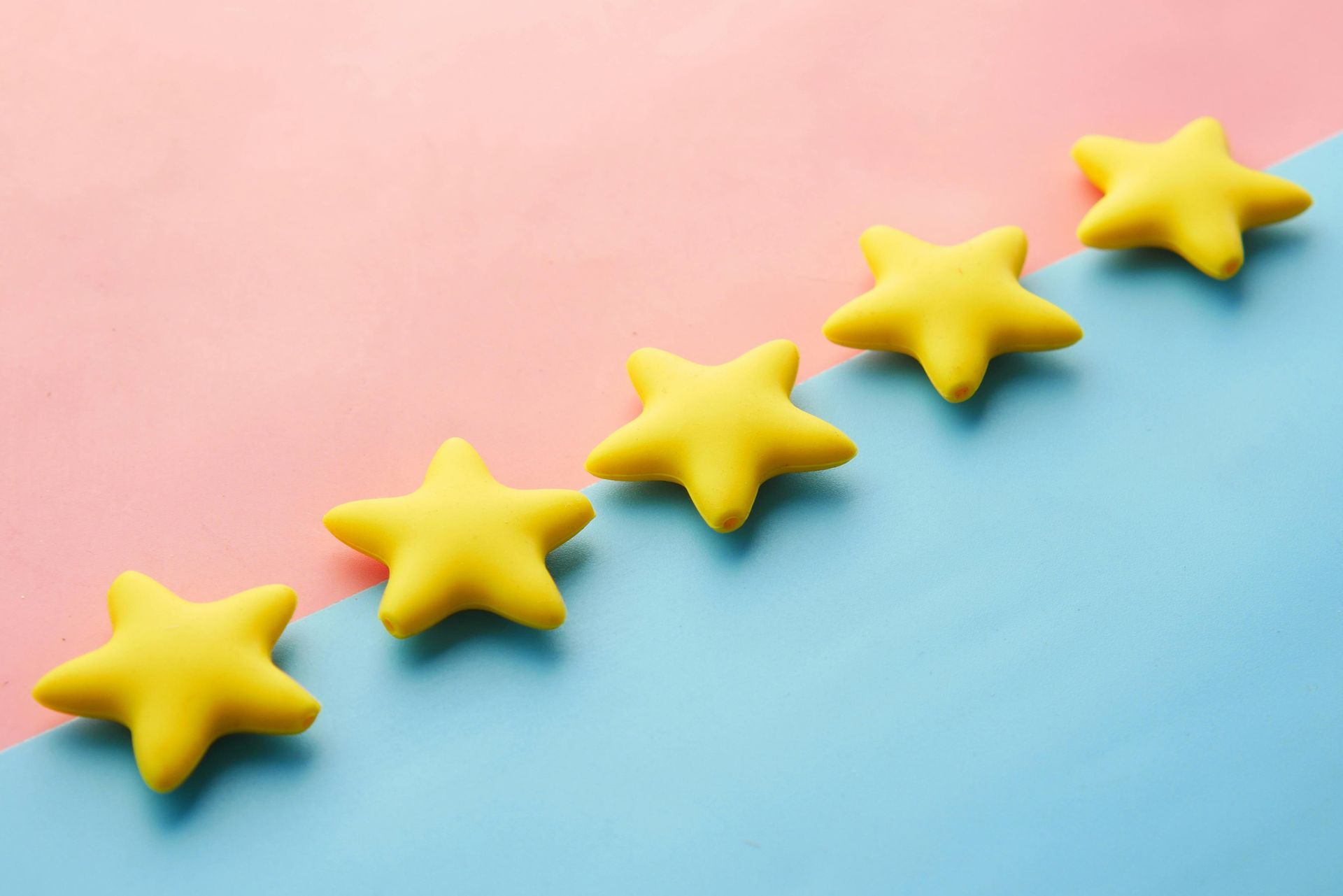
Yellow: This primary color is associated with happiness, sunshine, warmth, and can add notes of youthfulness to your brand’s message.
Orange: Providing feelings of excitement and confidence, orange adds an energetic and warm feeling to your brand.
Magenta: This inspiring choice allows your brand to stand out. It is a positive color allowing you to evoke feelings of hope, creativity, and kindness. It can send a message of femininity, uniqueness, and youthfulness.
Analyzing your audience, their emotions, and the specific niche of your products or services is crucial to understanding which colors will best communicate your message. Our graphic designers will help you determine which colors are best for your brand.
Crafting Harmonious Color Schemes
Beyond individual color meanings, how colors interact creates specific feelings with your customers. Understanding harmonious color schemes is key to building a cohesive brand palette:
- Complementary Colors: Opposites on the color wheel (e.g., blue and orange), they create high contrast and vibrancy, often used for emphasis.
- Analogous Colors: Adjacent colors on the color wheel (e.g., blues and greens), they offer a serene and harmonious feel.
- Triadic Colors: Colors that form a triangle on the color wheel (e.g., red, yellow, blue), providing a vibrant and balanced contrast.
When choosing a color palette for your business's marketing, consider what you sell and who you are promoting your products to. This will help you determine the colors that work best for you. Choosing a primary color that will take up most of your brand logo/image, then selecting secondary colors, will assist in developing your business color palette.
As Josh Davis, one of our expert Graphic Designers here at Crossbridge, states: “When choosing a color scheme, I always tell clients to think beyond personal taste — consider your audience, the emotional tone you want to set, and the context your brand will live in. Color isn’t just decoration; it’s a key element of design that communicates mood, trust, and intention at a glance.”
Crossbridge Marketing and our graphic design team are experts in developing a unique and successful brand for our clients. We utilize colors that speak your language and effectively promote your business. For professional logo design services and all your custom graphic design services for marketing materials, partner with Crossbridge.
We are your graphic design company specializing in branding that understands the true impact of color psychology in marketing. We succeed when you succeed.